Truth 2
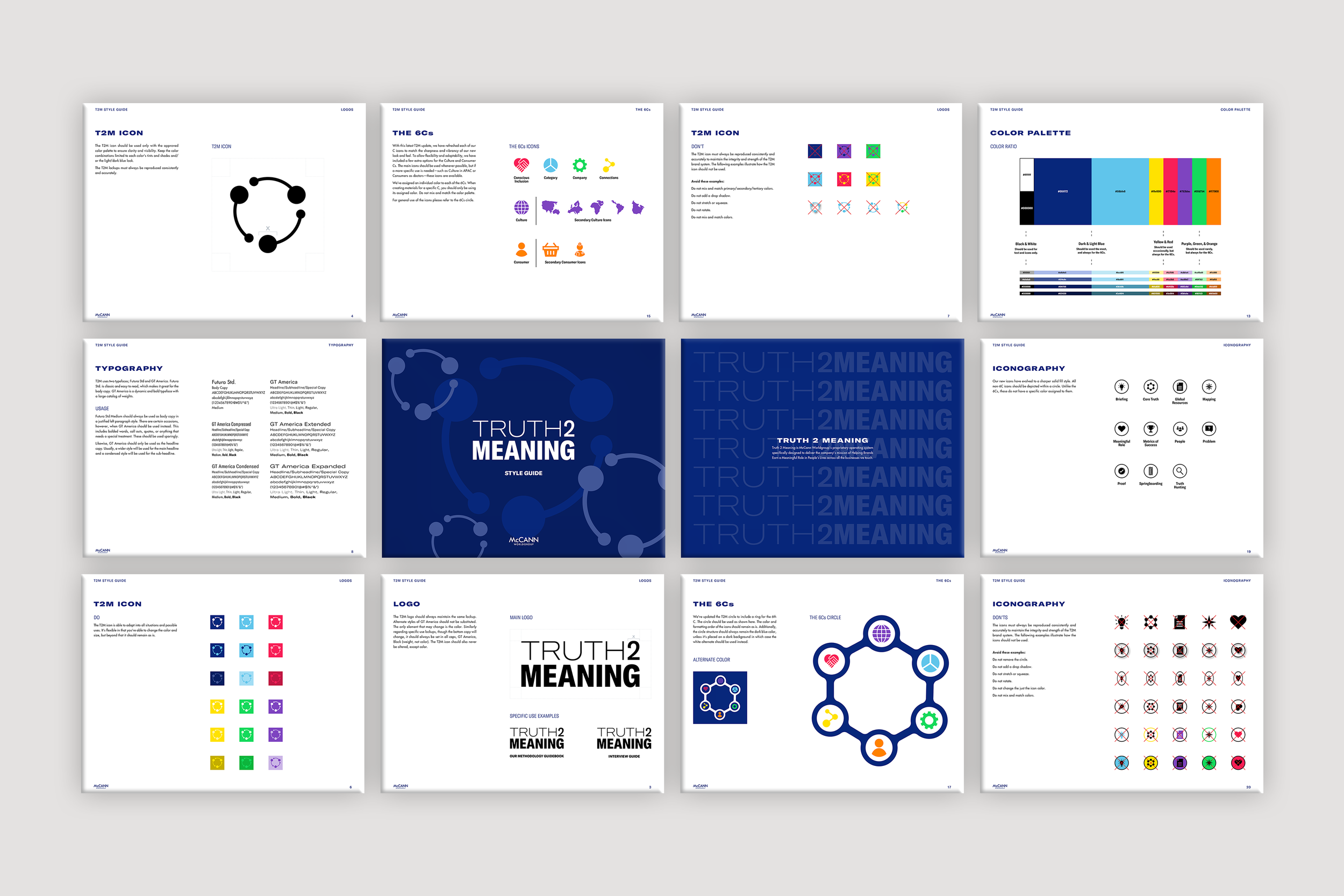
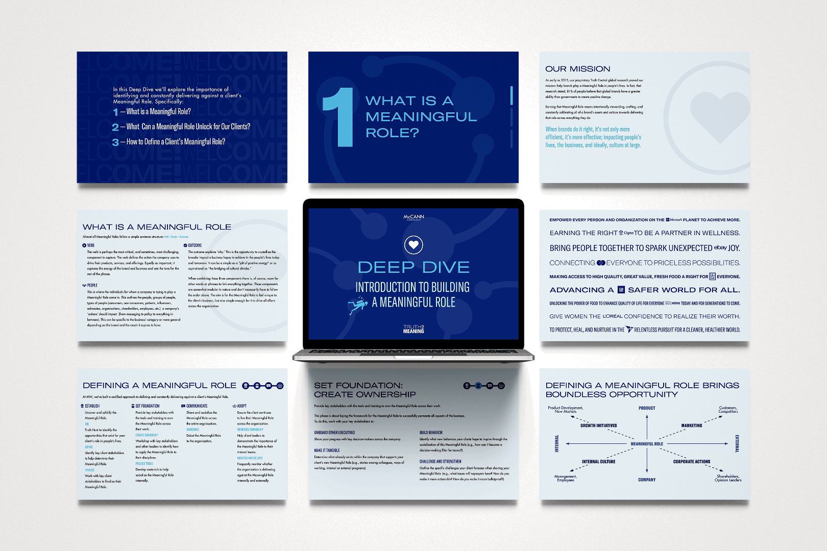
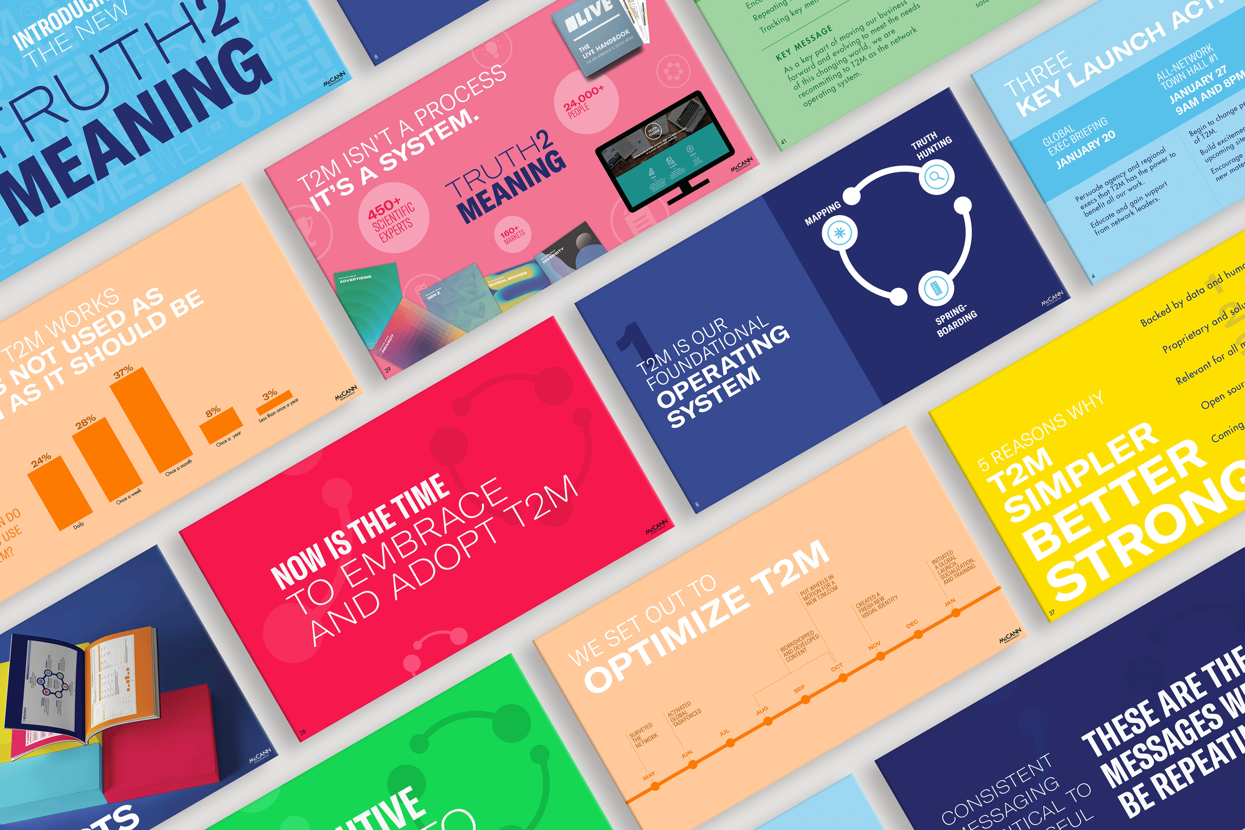
MeANingTruth 2 Meaning is a comprehensive rebrand of an established internal methodology used by 17K+ employees across six agencies and dozens of clients. The goal was to modernize the system while preserving familiar memory devices, creating an identity that is clear, visually compelling, and easy to navigate. Inspired by bold, contemporary design, the new direction introduced a flexible visual system adaptable across markets, applications, and audiences.
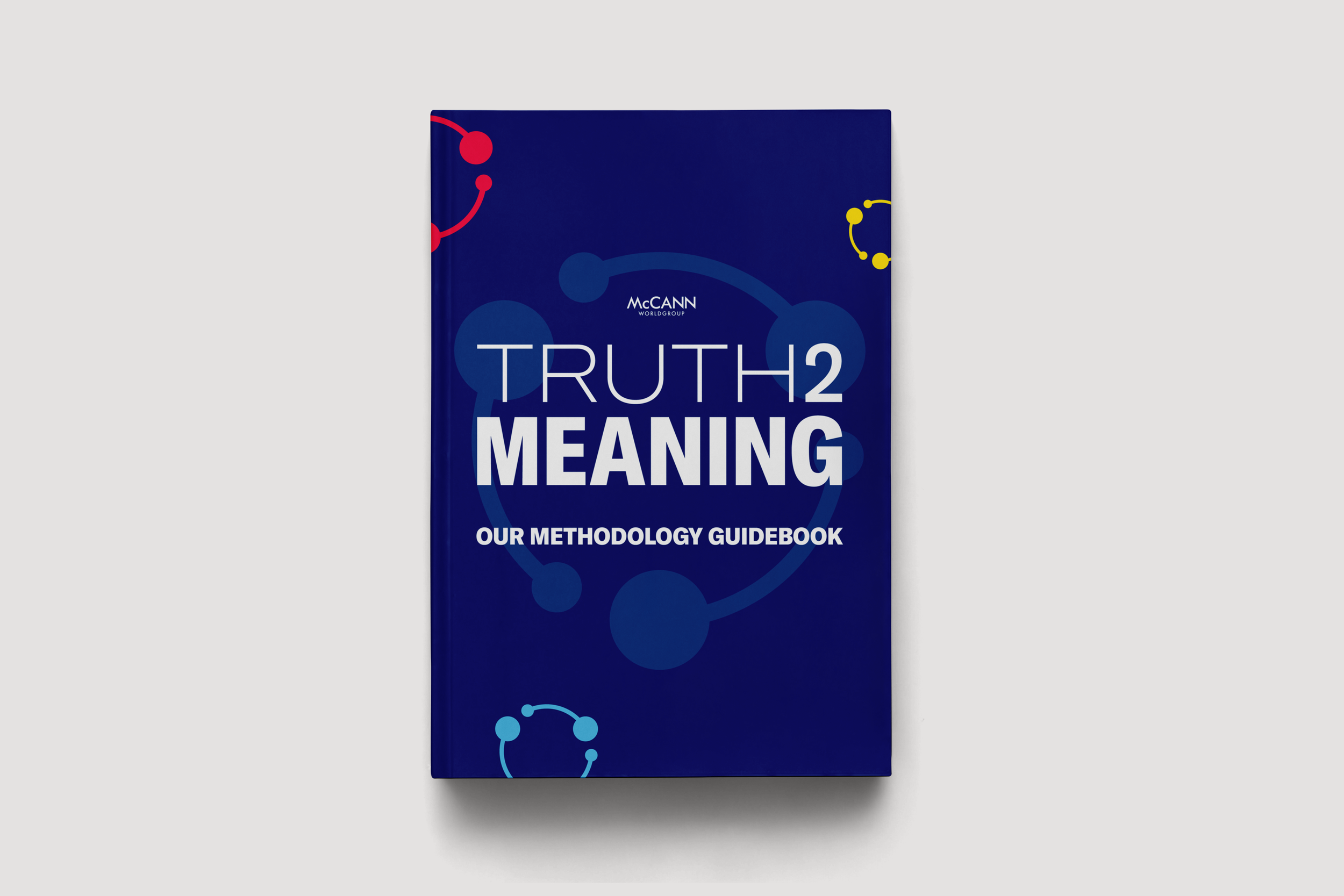
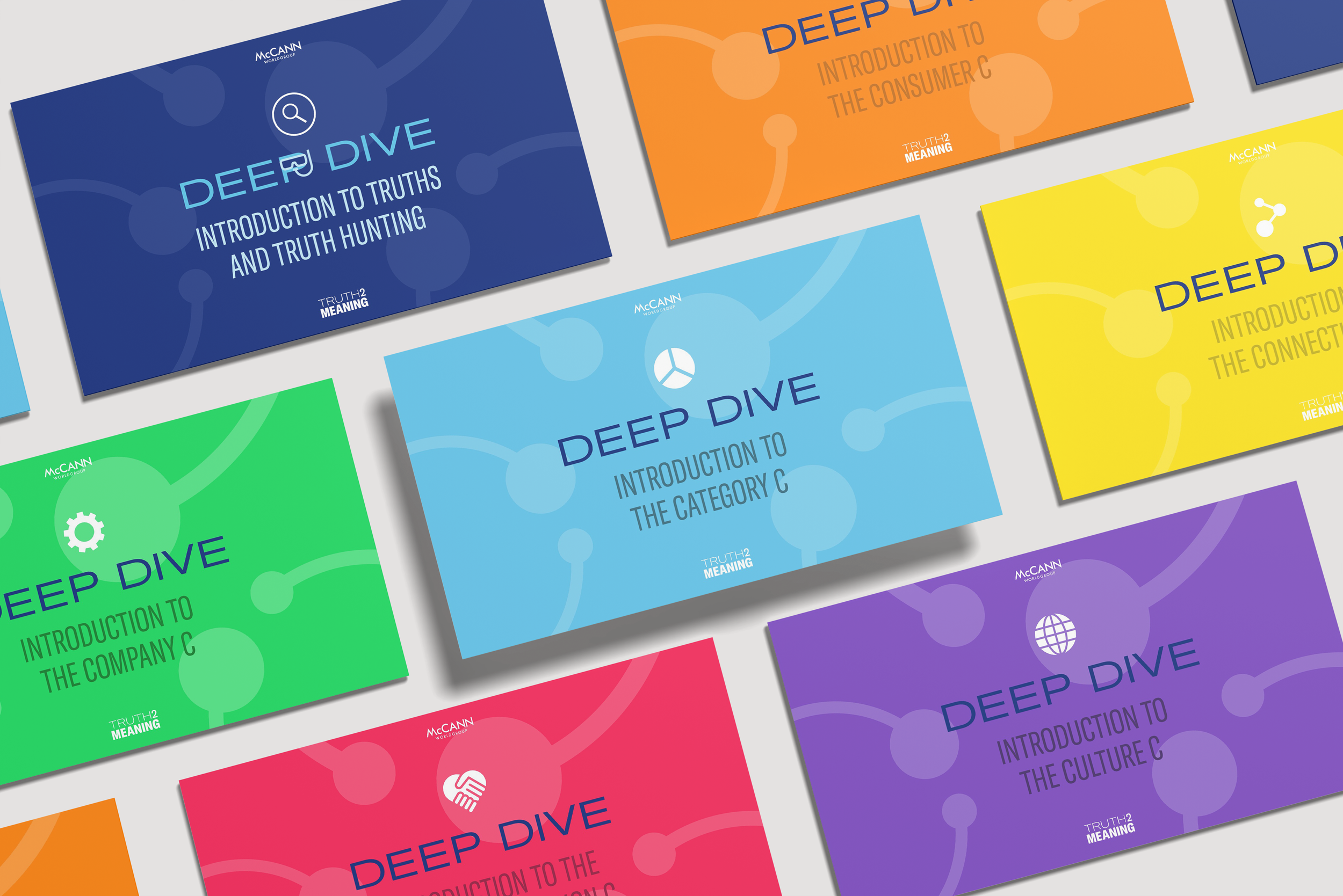
Typography, color, and iconography were refreshed to create a more cohesive language, with an expanded color system to organize content and a reimagined icon library for a stronger, more confident presence. The updated identity was applied across the full methodology suite – guidebooks, worksheets, client tools, presentations – and extended into the Truth 2 Meaning internal website, reinforcing it as a scalable, organization-wide resource.
ROLE | Lead Designer
CONTRIBUTORS | Abbe Sublett, María Vargas, Phill Hess
DELIVERABLES | Brand identity and design system, print and digital toolkits, web, social, presentation design